Zevnix AI
0
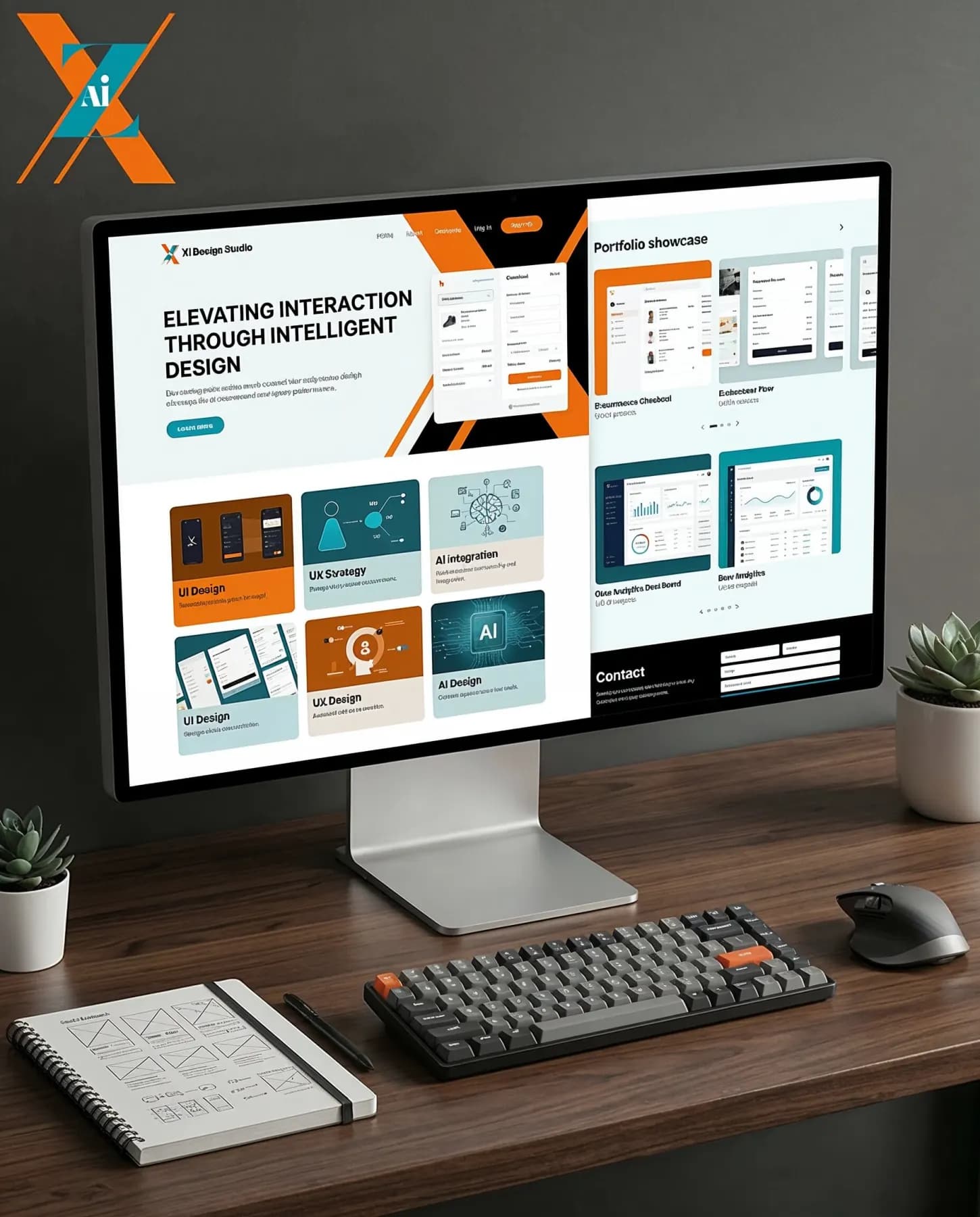
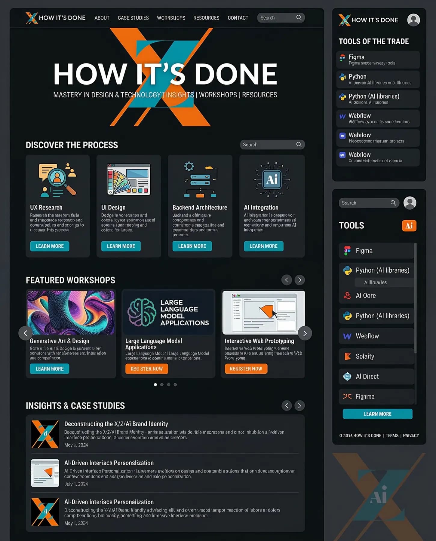
Zevnix AI needed a web presence that made a complex platform feel approachable without dumbing it down. We designed a clean, fast layout with clear hierarchy and a visual language that lets the product speak without needing explanation.
Every section of the site was built to reduce friction for two different audiences: technical buyers evaluating the platform and business decision makers who just need to understand the value.
0
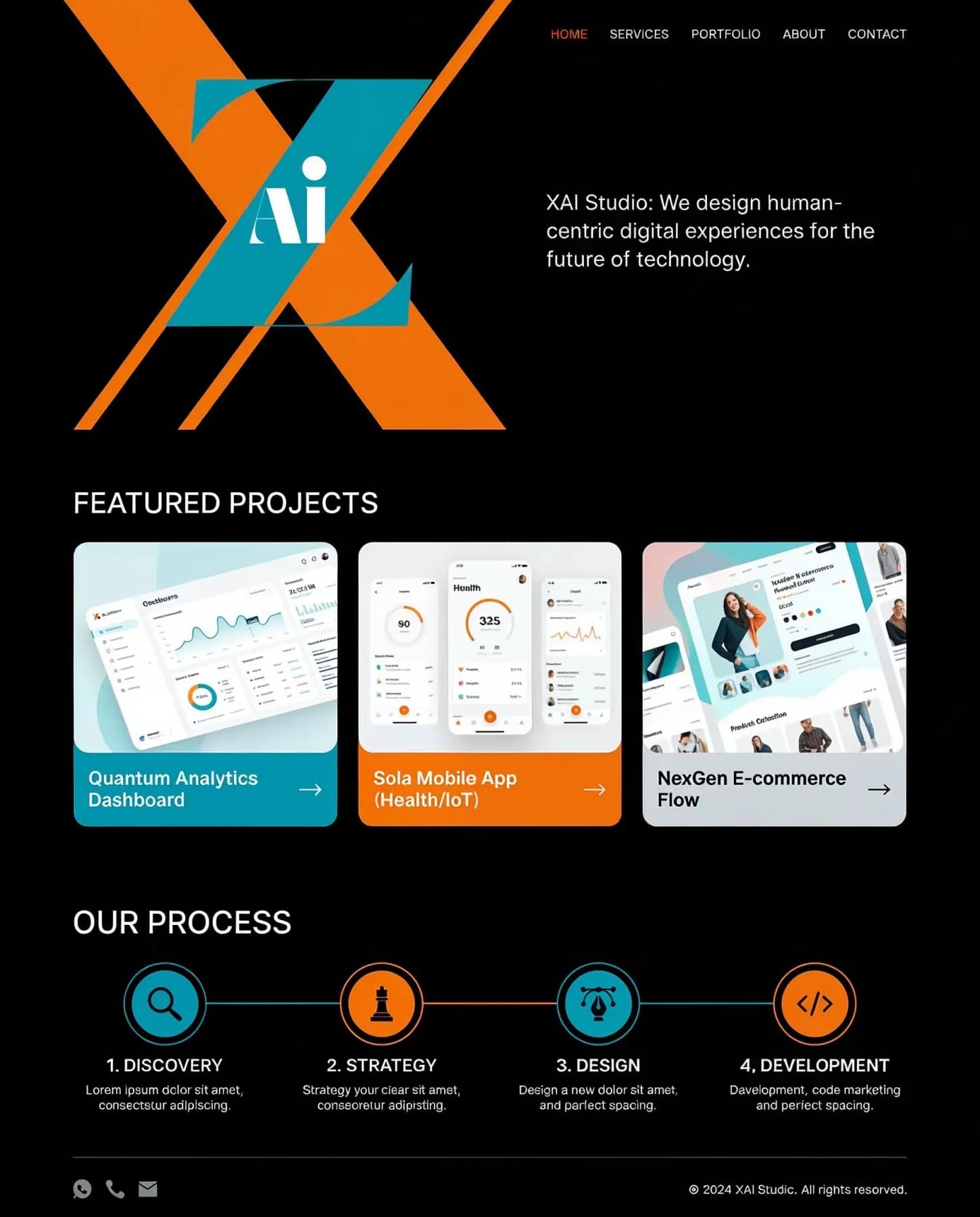
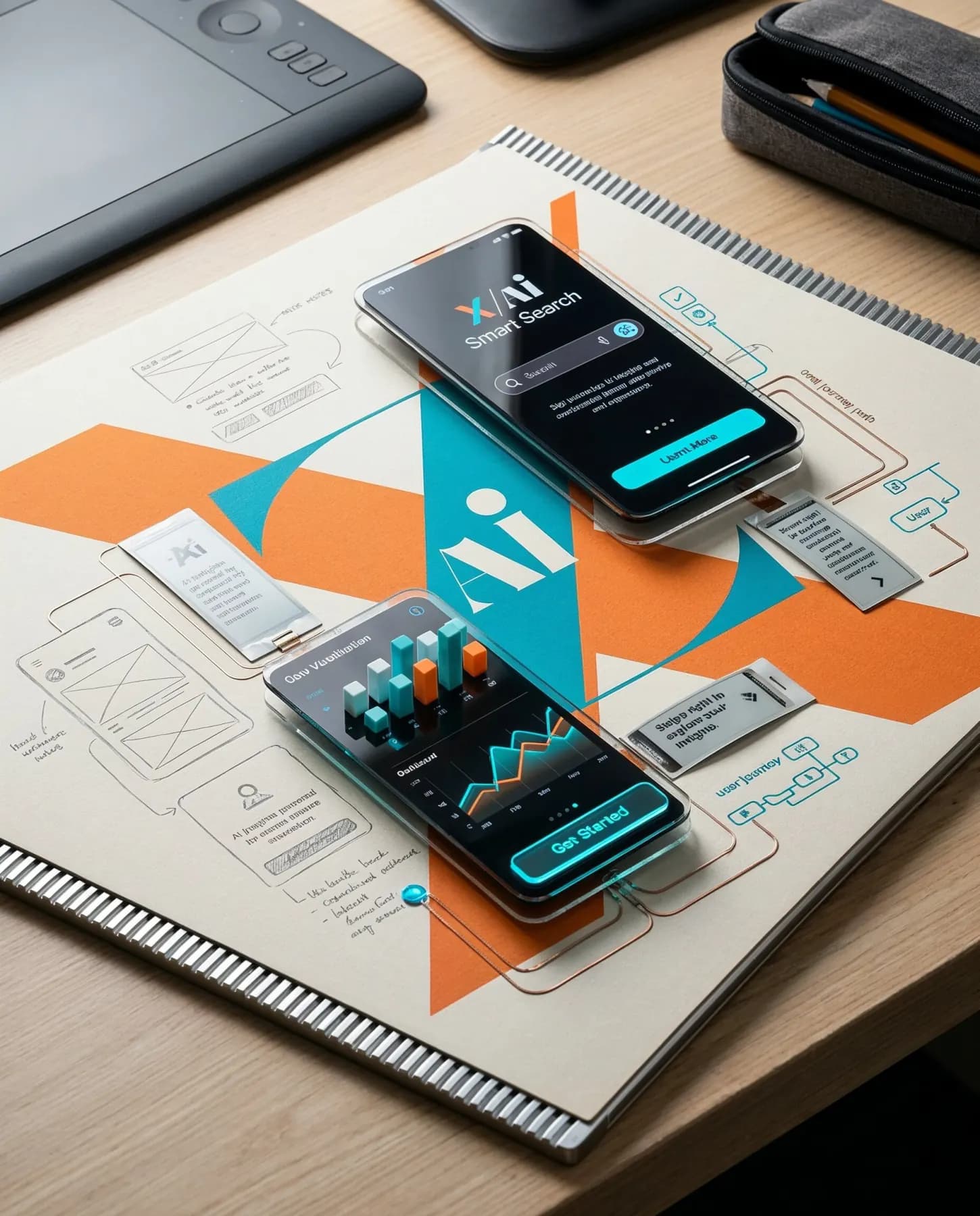
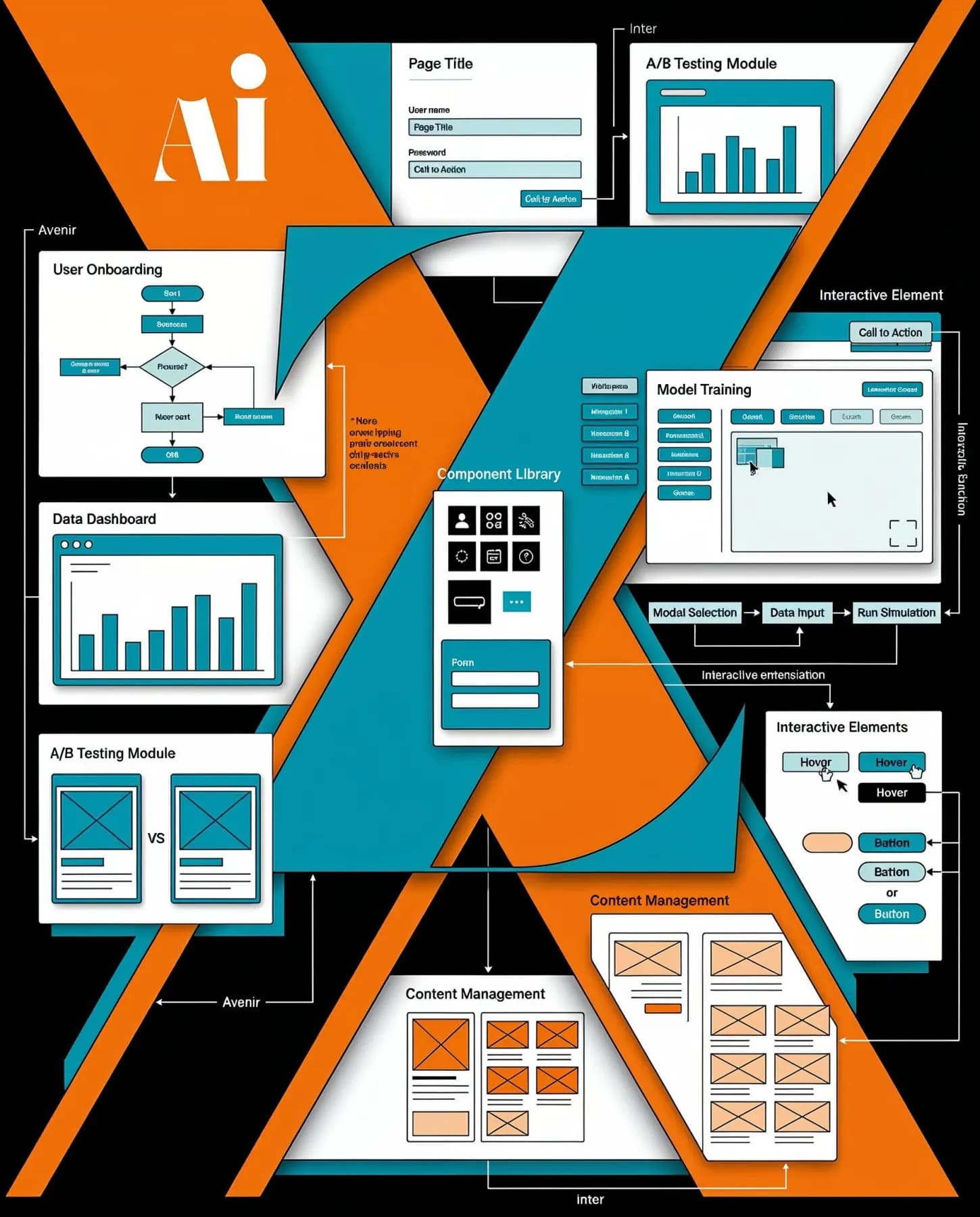
We mapped every user flow before touching the interface. The platform has a lot of moving parts, so the design system had to scale. Every screen was tested against real user paths, not just the easy cases.
The result is an interface that guides users through complexity without making them feel it.
0
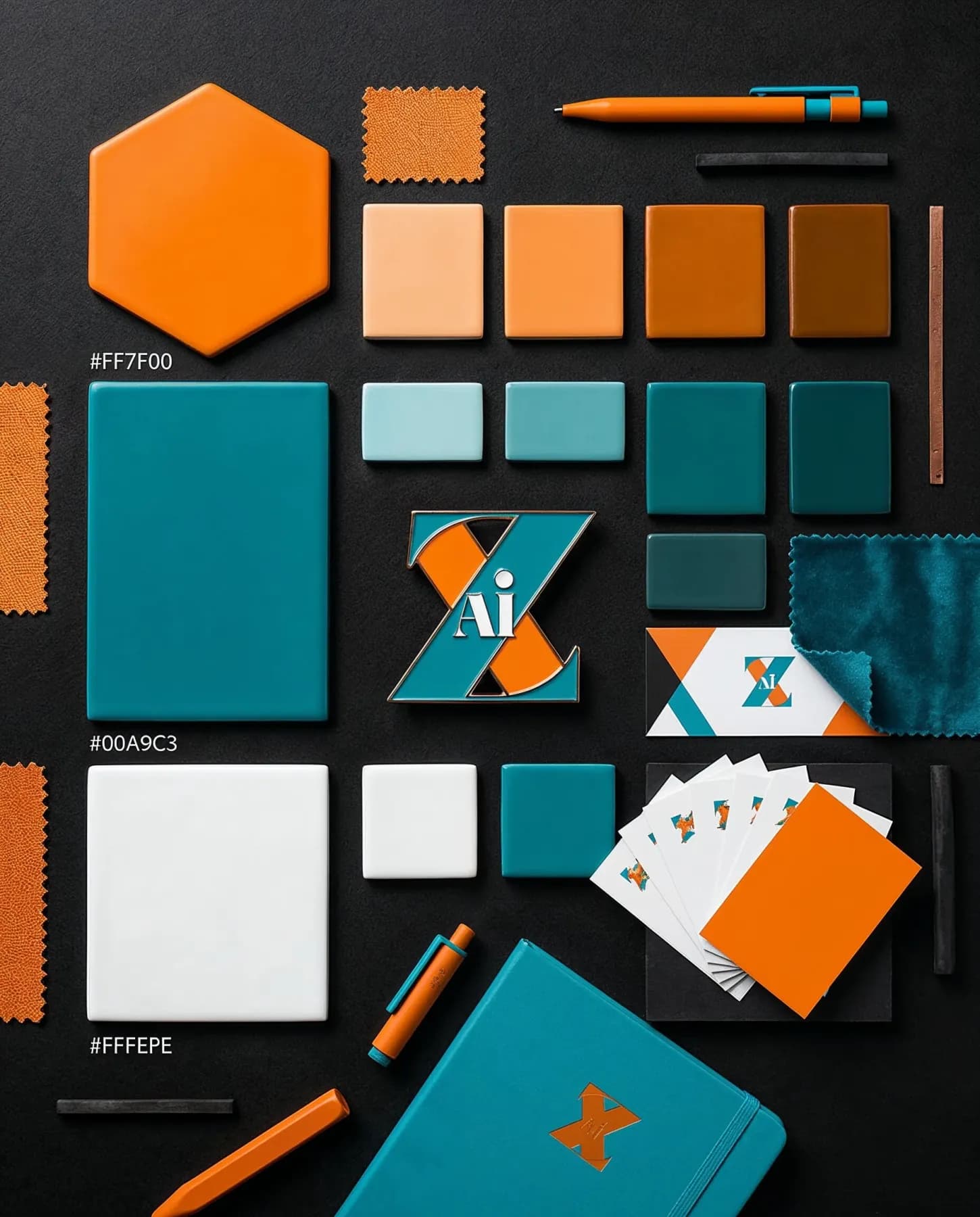
Zevnix needed an identity that read as both technical and approachable. We built the logo, color system, and type to work across product interfaces, pitch decks, and marketing without looking like a generic AI startup.
The identity now holds up at every size and context, from a browser favicon to a conference banner.